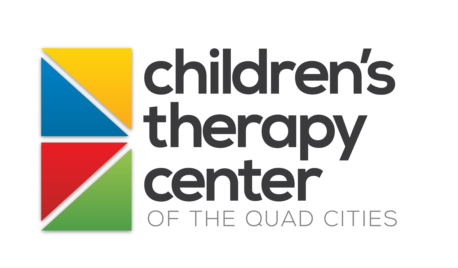
Children's Therapy Center Logo
This version of the CTC logo was created with the intention of the blocks being building blocks of different shapes and colors coming together to form one “whole” shape. Meaning, no matter what types of therapy a child needs, the center can help fit the pieces together however needed, to help the child. A secondary “theme” from the logo is the four pieces being representative the Quad Cities, without adding additional text to the logo. The colors are intentionally primary, being attractive and reminiscent of children. The text is simple and clean, keeping the logo simple and easy to read.